The Complete Guide to Perfect Font Pairing

Font pairing is one of those design skills that seems simple in theory but can be surprisingly tricky in practice. Pair the wrong fonts together, and your design feels chaotic or amateurish. Get it right, and you create visual harmony that elevates your entire project. Whether you're designing a website, creating a presentation, or building a brand identity, mastering font pairing is essential.
Why Font Pairing Matters
Think of font pairing like choosing an outfit. You wouldn't wear a tuxedo jacket with gym shorts, right? Fonts work the same way—they need to complement each other while serving different purposes. A good font pairing creates visual hierarchy, guides the reader's eye, and reinforces your message. A bad pairing? It distracts, confuses, and undermines your credibility.
The goal isn't just to pick two fonts that look nice individually. You need fonts that work together as a system, creating contrast where needed while maintaining overall cohesion. This balance between similarity and difference is what makes font pairing both challenging and rewarding.
The Golden Rules of Font Pairing
- Create Contrast: Pair fonts that are distinctly different. A bold sans-serif headline with a classic serif body text creates clear hierarchy and visual interest.
- Limit Your Palette: Stick to 2-3 fonts maximum. More than that and your design starts to feel chaotic and unprofessional.
- Consider Mood: Fonts have personalities. Make sure your pairings convey the right emotion for your project—playful, serious, modern, traditional.
- Test at Different Sizes: Fonts that look great together at large sizes might clash at small sizes. Always test your pairings in context.
- Mind the Details: Pay attention to x-height, stroke width, and spacing. Fonts with similar proportions tend to work better together.
Classic Pairing Strategies
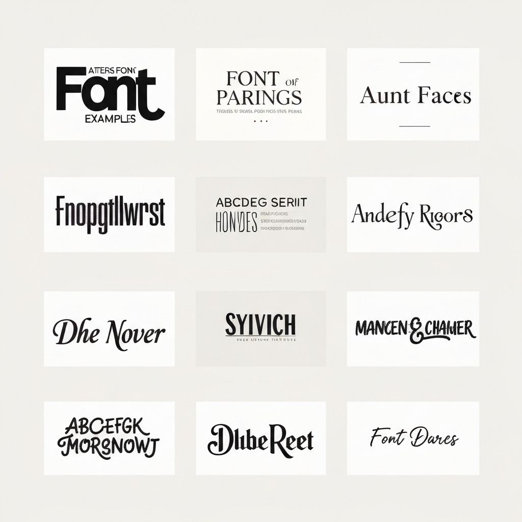
The serif-sans-serif combination is a timeless classic for good reason. Serif fonts bring elegance and tradition, while sans-serifs offer clean modernity. This contrast creates natural hierarchy—use a serif for headlines to add gravitas, or flip it and use sans-serif headlines for a contemporary feel with serif body text for readability.
Another reliable approach is pairing fonts from the same family. Many professional typefaces come in both serif and sans-serif versions designed to work together. This guarantees visual harmony since they share the same underlying proportions and design philosophy. It's like having a matching set—effortless coordination.
Common Pairing Mistakes to Avoid
One of the biggest mistakes is pairing fonts that are too similar. Two sans-serifs with nearly identical weights and proportions don't create contrast—they just look like you couldn't make up your mind. If you're going to use two fonts from the same category, make sure they're distinctly different in weight, style, or character.
Another pitfall is ignoring context. A font pairing that works beautifully for a wedding invitation might be completely wrong for a tech startup's website. Always consider your audience, medium, and message. The best font pairing is one that serves your specific project, not just one that looks cool in isolation.
Testing and Refining Your Pairings
Don't trust your first instinct. Create mockups with real content at actual sizes. Read through paragraphs of body text. Look at your design on different devices and screens. What looks perfect on your high-resolution monitor might be illegible on a phone. What seems elegant in a design file might be exhausting to read in a long article.
Get feedback from others, especially people outside the design world. They'll experience your font choices the way your actual audience will—without the designer's eye for technical details. If something feels off to them, it probably is, even if you can't immediately articulate why.
Font pairing is both an art and a science. While there are principles and guidelines to follow, the best pairings often come from experimentation and trusting your eye. Start with proven combinations, understand why they work, then gradually develop your own instincts. With practice, you'll develop an intuition for which fonts complement each other, and font pairing will become second nature rather than a source of design anxiety.
About Marcus Rodriguez
Senior Designer and Typography Consultant with 15 years of experience


