Typography Trends Shaping Design in 2026

Typography is having a moment. As we move through 2026, designers are pushing boundaries, breaking rules, and reimagining how text can communicate, evoke emotion, and create memorable experiences. Whether you're a seasoned designer or just starting out, understanding these trends will help you create work that feels fresh and relevant.
Variable Fonts Take Center Stage
Variable fonts have been around for a few years, but 2026 is the year they've truly come into their own. Unlike traditional fonts that require separate files for each weight and style, variable fonts contain multiple variations in a single file. This isn't just a technical convenience—it's opening up entirely new creative possibilities.
Designers are using variable fonts to create dynamic, responsive typography that adapts to screen size, user preferences, or even scrolling behavior. Imagine headlines that gradually become bolder as you scroll down a page, or text that adjusts its weight based on the background color for optimal readability. These aren't gimmicks—they're thoughtful applications of technology that enhance user experience.
Experimental and Expressive Display Fonts
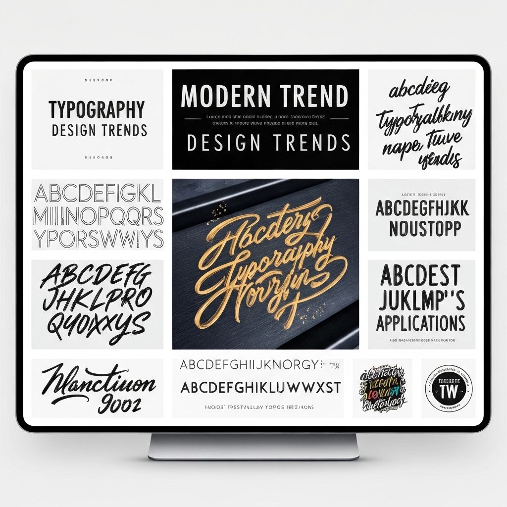
While minimalism dominated design for years, 2026 is seeing a rebellion against the safe and predictable. Experimental display fonts—with unusual shapes, unexpected ligatures, and artistic flourishes—are everywhere. These fonts aren't meant for body text; they're statement pieces that grab attention and convey personality.
What makes this trend work is restraint. The best designers use these expressive fonts sparingly, pairing them with clean, readable body text. It's about creating contrast and hierarchy, not overwhelming the viewer. Think of it like seasoning in cooking—a little goes a long way.
Retro and Nostalgic Typography
Everything old is new again. Fonts inspired by the 70s, 80s, and 90s are making a major comeback, but with a modern twist. We're seeing groovy rounded fonts reminiscent of the 70s, bold geometric shapes from the 80s, and the playful, slightly chaotic energy of 90s design. The key difference? Today's designers are applying these vintage aesthetics with contemporary color palettes, layouts, and digital effects.
This nostalgia trend taps into something deeper than just aesthetics—it's about evoking emotion and creating connections. For older audiences, these fonts trigger memories and positive associations. For younger audiences, they offer a fresh take on styles they've only seen in photos and movies.
Kinetic Typography and Animation
Static text is so last decade. With improved web technologies and faster internet speeds, animated typography is becoming standard rather than exceptional. We're seeing text that morphs, bounces, glitches, and transforms in ways that would have been impossible or impractical just a few years ago.
The best kinetic typography serves a purpose beyond just looking cool. It guides the eye, emphasizes key messages, and creates rhythm in the user experience. Animation can make text more accessible too—subtle motion can help dyslexic readers track lines more easily, and animated captions can make video content more engaging.
Accessibility-First Typography
Perhaps the most important trend of 2026 isn't about aesthetics at all—it's about inclusivity. Designers are finally prioritizing accessibility in their typography choices, and it's making the web better for everyone. This means choosing fonts with clear letterforms, maintaining sufficient contrast ratios, and ensuring text remains readable at various sizes.
Accessibility-focused fonts like Atkinson Hyperlegible and Lexend are gaining popularity not just for their readability, but because they prove that accessible design doesn't have to be boring. These fonts are beautiful and functional, showing that good design should work for everyone.
Mixing Serif and Sans-Serif
The old rule was simple: pick either serif or sans-serif and stick with it. In 2026, designers are confidently breaking that rule. Thoughtful combinations of serif and sans-serif fonts create visual interest and hierarchy while maintaining readability. The key is choosing fonts that complement rather than compete with each other.
This trend works particularly well in editorial design and long-form content. A classic serif for headlines paired with a clean sans-serif for body text creates a sophisticated, magazine-like feel. Or flip it—use a modern sans-serif for headlines and a traditional serif for body text to create a more academic or authoritative tone.
Typography trends come and go, but the fundamental principles remain: clarity, hierarchy, and purpose. The best designers in 2026 aren't just following trends—they're using these evolving styles as tools to solve communication problems and create meaningful experiences. Whether you embrace variable fonts, experiment with kinetic typography, or stick with timeless classics, the goal is always the same: to communicate effectively and beautifully.
About Marcus Rodriguez
Senior Designer and Typography Consultant


